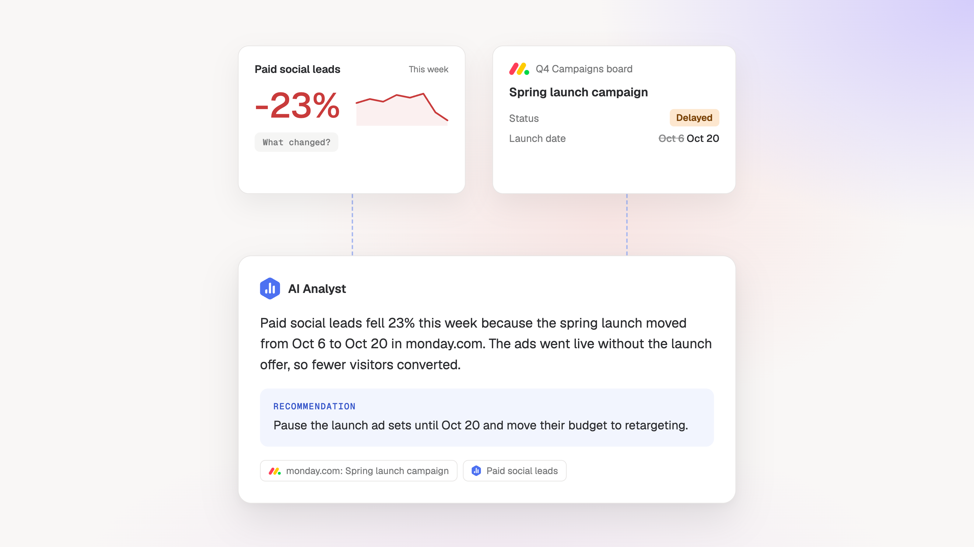
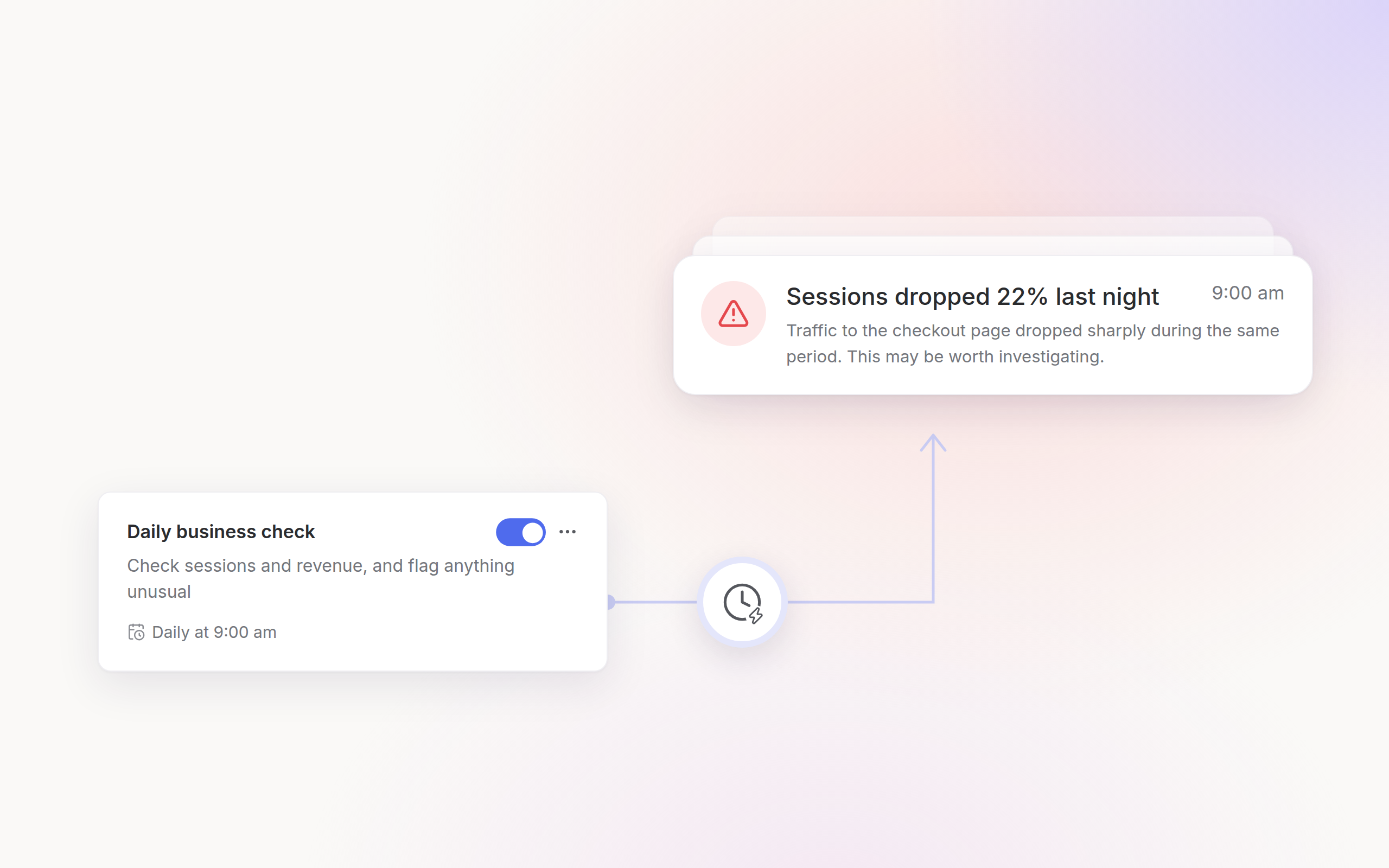
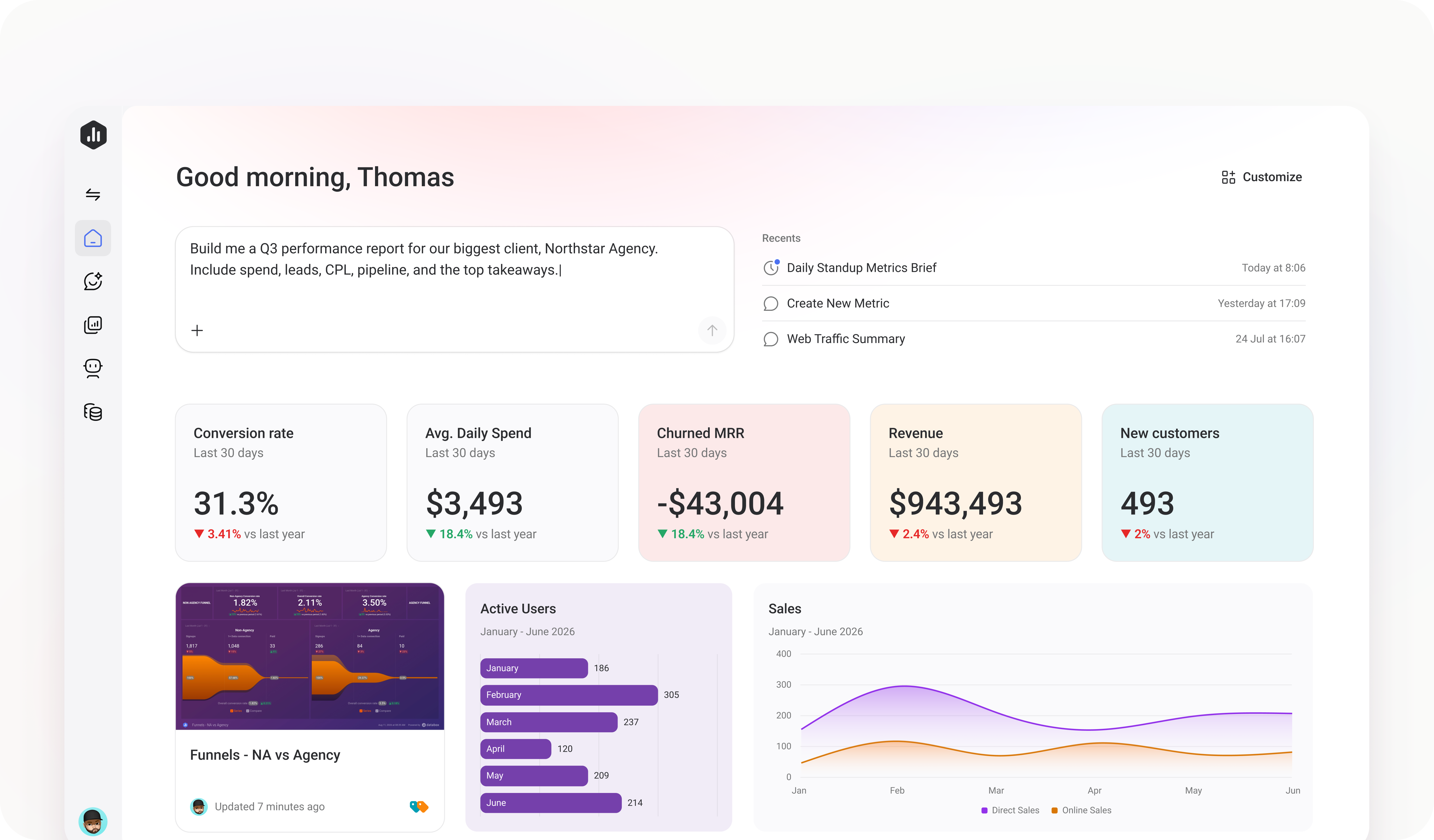
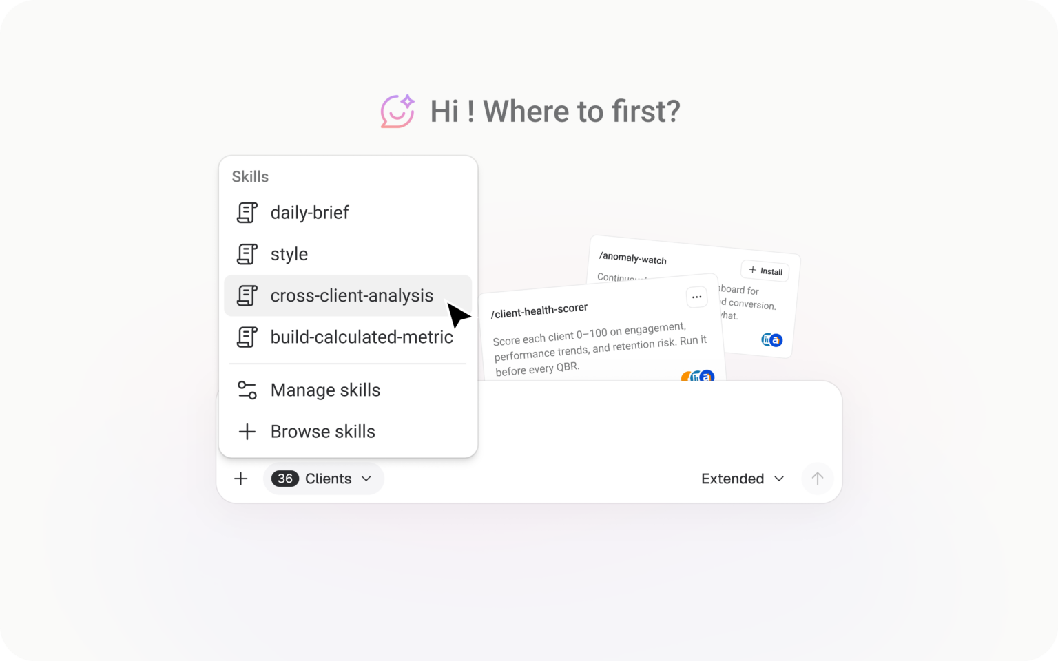
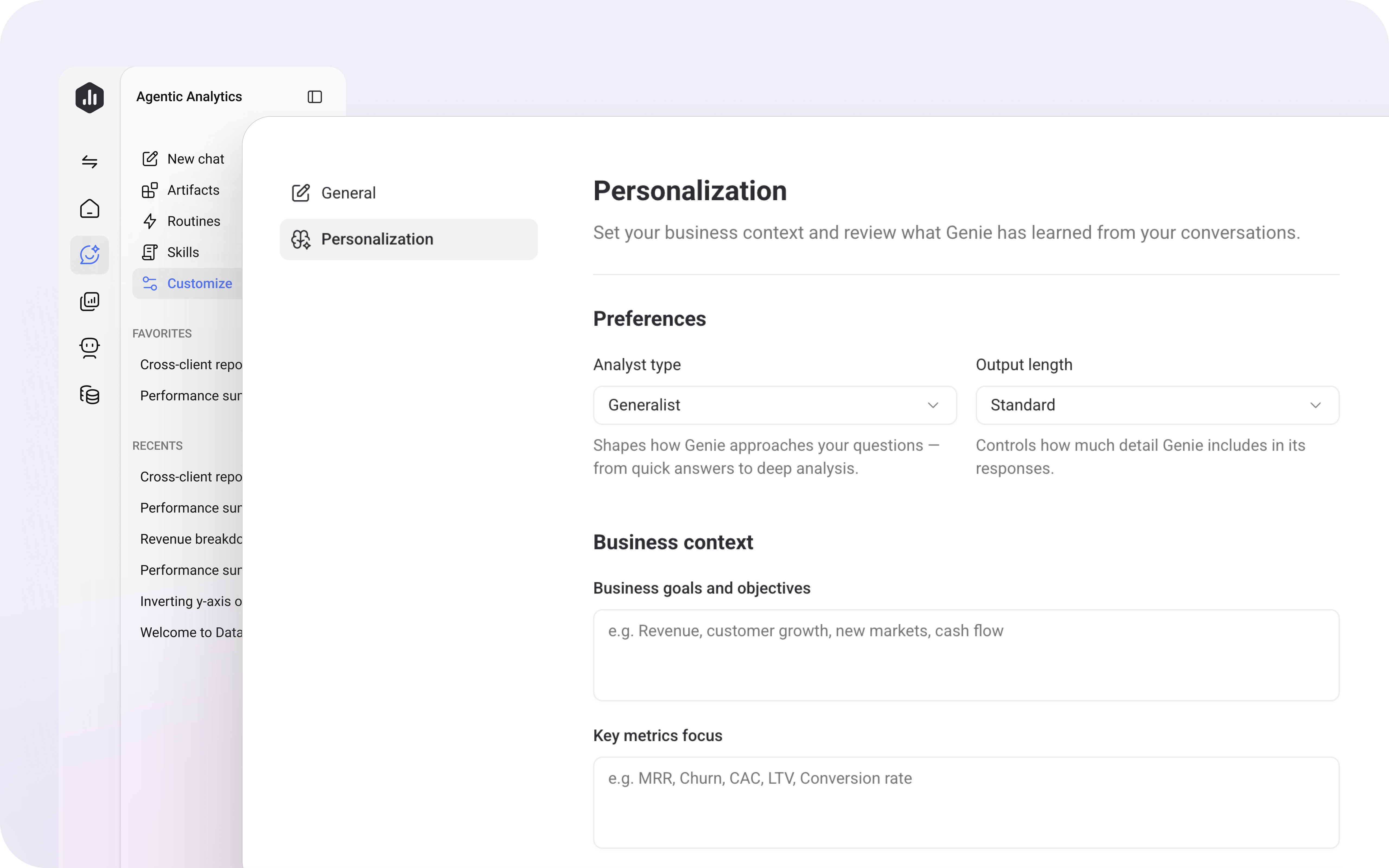
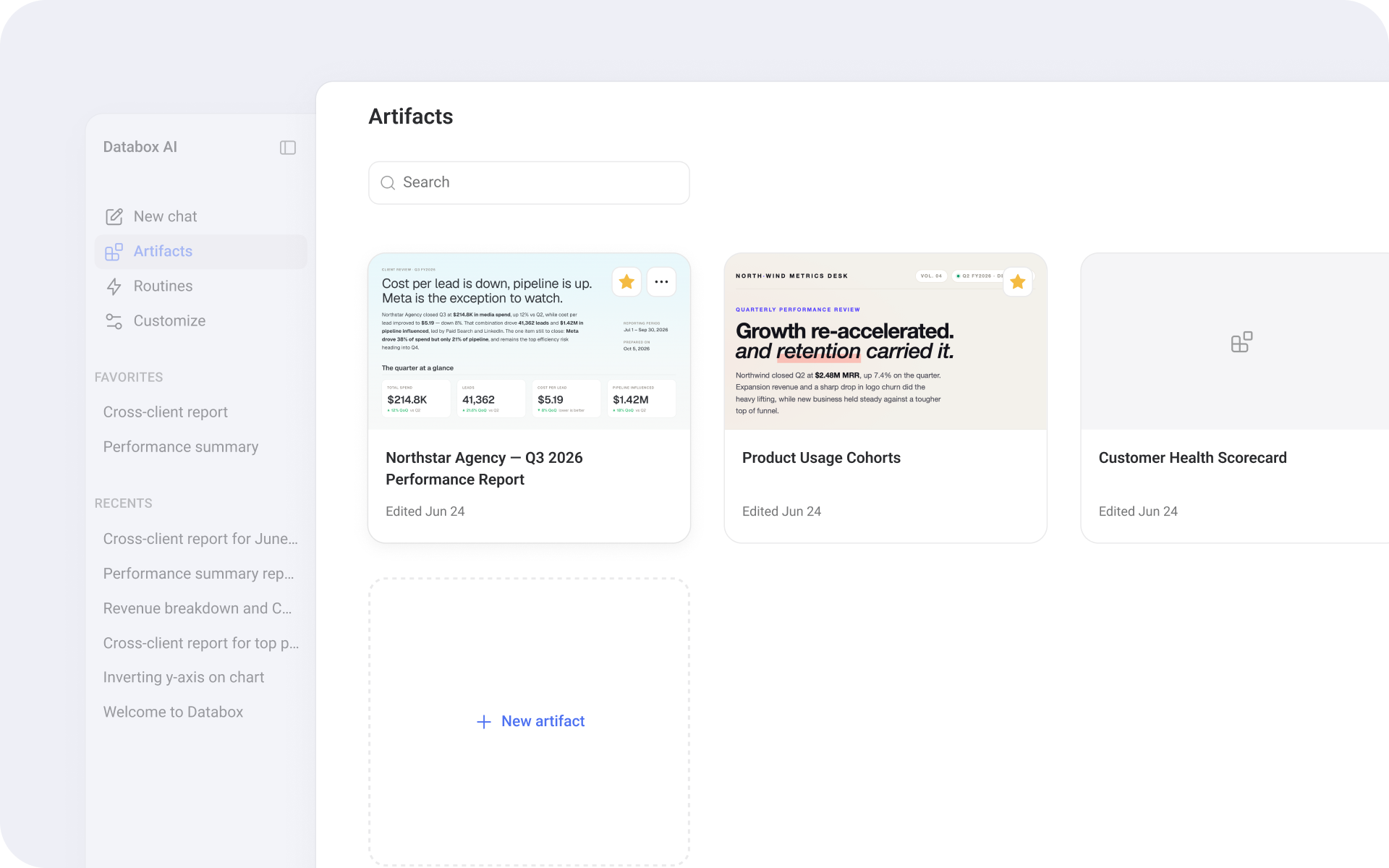
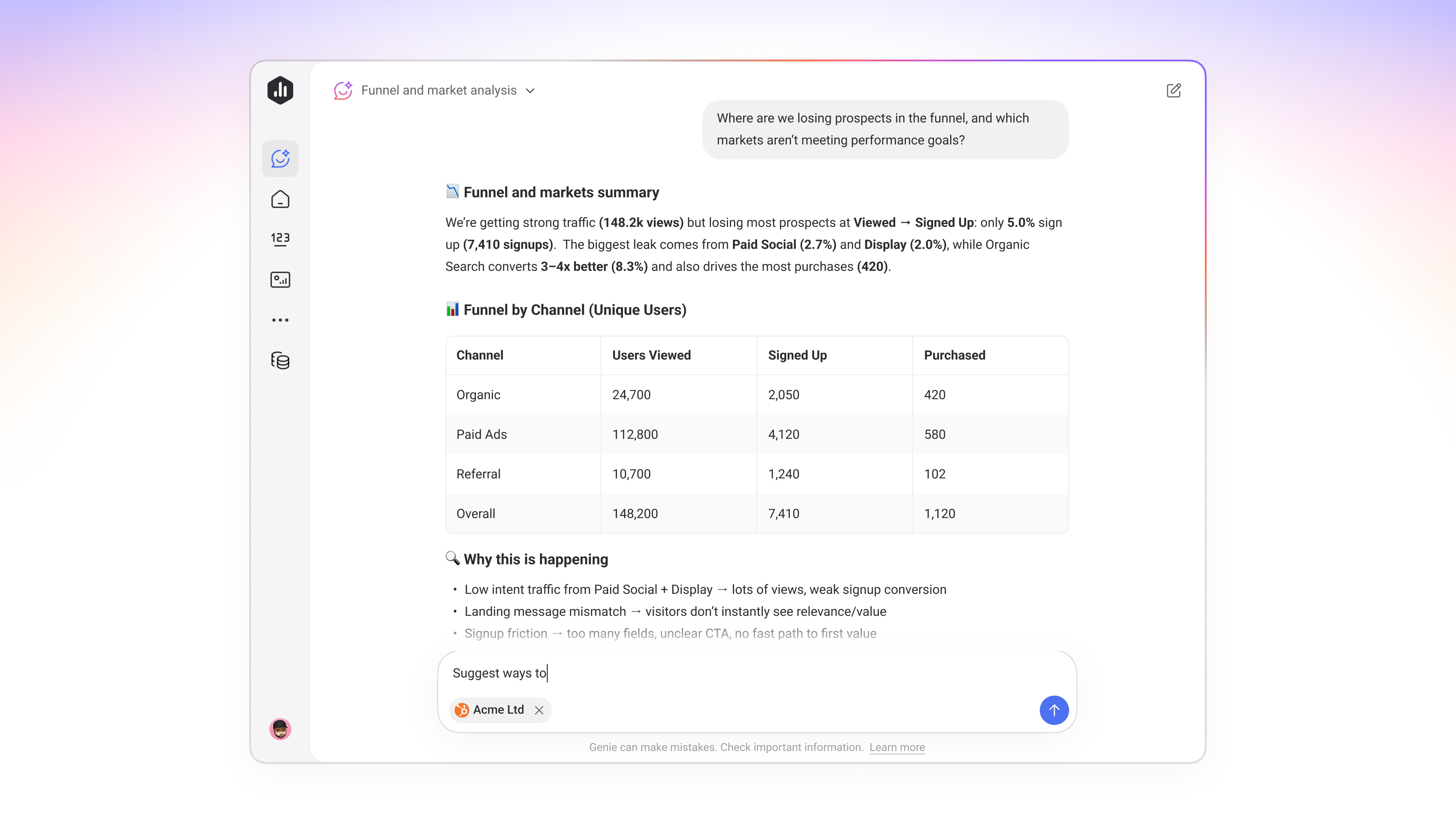
You can now click into any artifact and edit the text directly. Tweak a headline or bold what's important, so the final touches before you share take seconds instead of another round of prompting.
Define what your data actually means
Now you can define what each dataset and column means, so your team and AI Analyst read every number the same way.
- Understand any dataset without asking the analyst. Document what each dataset and column means in plain language, so anyone can read it on their own.
- Get the right answer no matter how it's phrased. Capture the other names your team uses for a dataset or column, so your AI Analyst answers the real question even when someone words it differently.
- Keep every query on the right dates. Set a default time dimension for each dataset, so queries and AI answers always pull from the correct date column.
Get every team and AI working from the same numbers
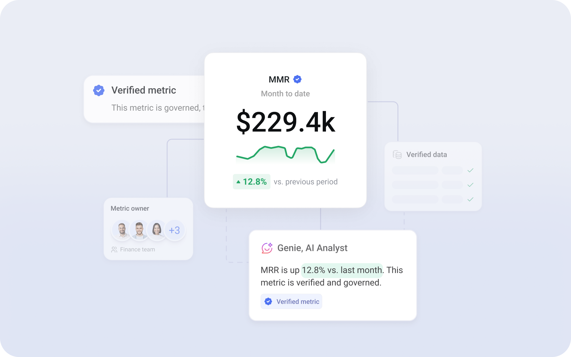
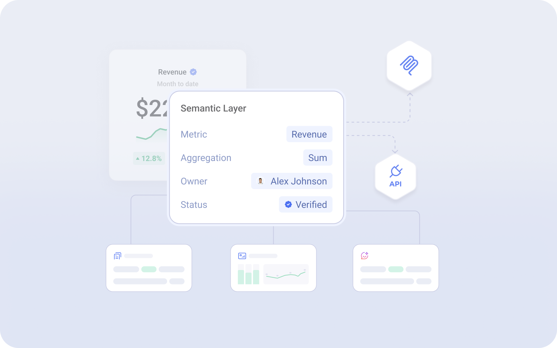
Now you can verify metrics, datasets, dashboards, and reports, so everyone on your team, including Genie, knows which version is official.
- Verified badge on every official asset: Anyone with edit rights can verify a metric, dataset, Databoard, or report, and a verified badge appears next to its name so the trusted version stands out wherever it shows up.
- Recorded verification history: Every verification logs who verified the asset and when, so you have an audit trail when leadership asks where a number came from.
- AI answers grounded in verified assets: The AI Analyst reads verification status as a trust signal, so its answers come from the same official version your team already relies on.
Turn your analysis into a polished, shareable report
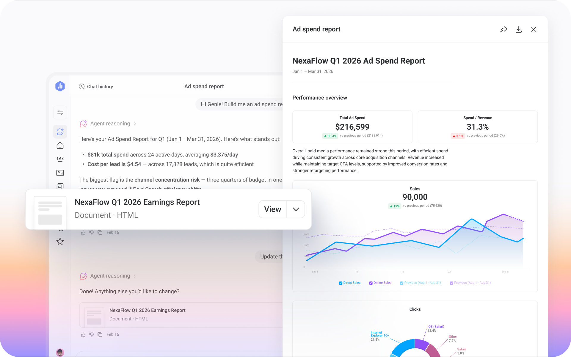
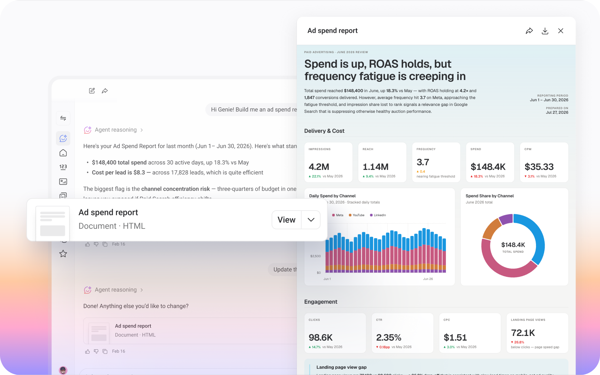
Now, you can package any Genie conversation into an Artifact: a polished, interactive document built from your connected data that you can send to anyone.
- Generate a full report from your conversation: Ask Genie to turn its analysis into a report, and you'll get back a finished, interactive document.
- Share with anyone: Send the Artifact through a public link or download it as a PDF. No Databox login required.
- Switch formats anytime: Ask Genie to convert the report into a slide deck, dashboard, or another format, and it rebuilds the Artifact for you.
- Customize the styling: Ask Genie to restyle the Artifact with your colors, fonts, or layout, and it rebuilds the Artifact to match.
Get richer answers in your next Claude conversation
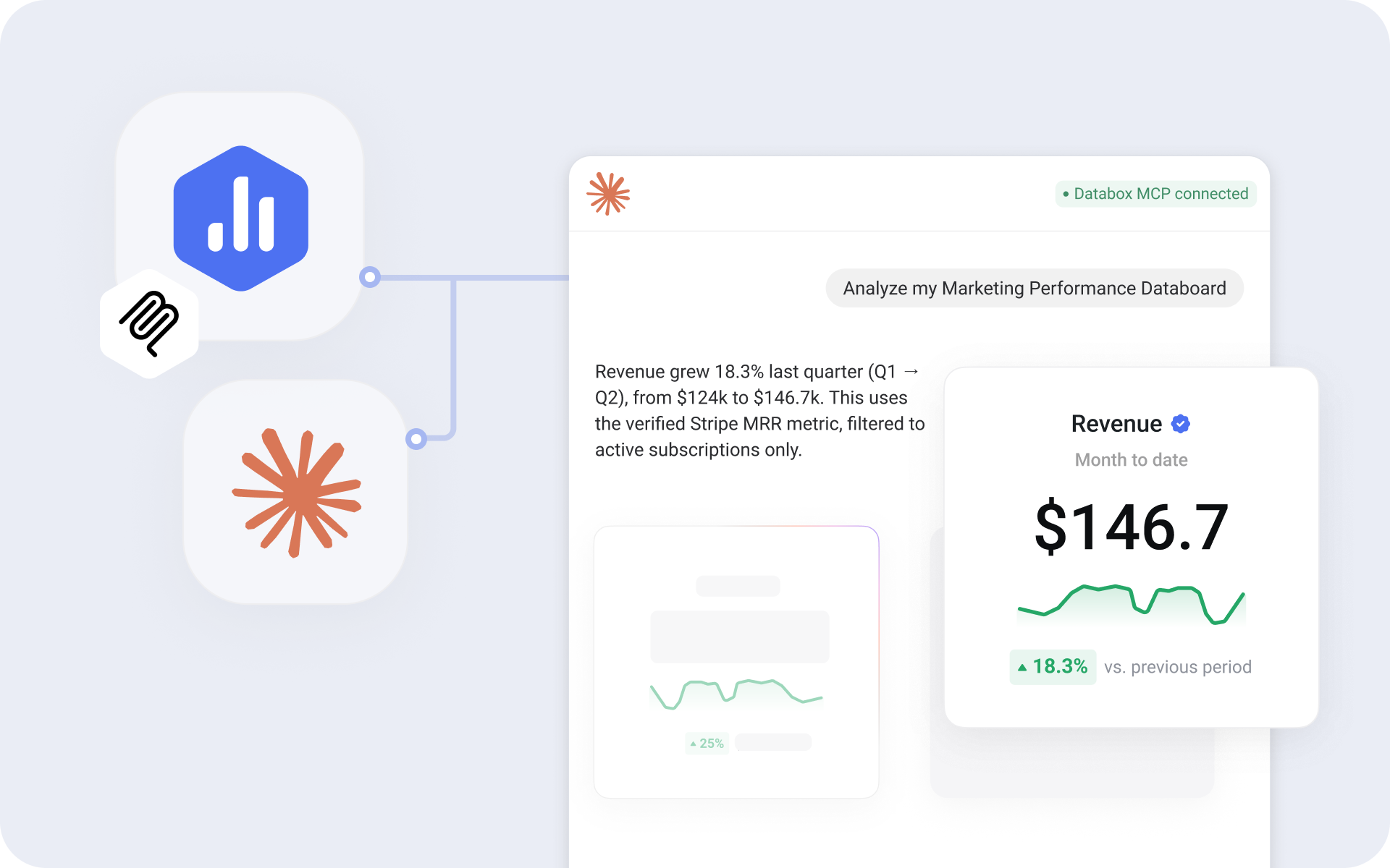
Now, when you use Databox MCP with Claude, you'll see interactive charts right inside your conversation and can analyze any of your Databoards just by asking about it.
For example, ask about your revenue and the chart appears right next to the answer, so you can see the trend, explore patterns, and ask the next right question. Or ask Claude to analyze your "Marketing Performance" Databoard, and it pulls the right metrics and explains what changed, so you walk away with an answer you can take straight into a client update or a leadership review.
Manage Data Sources And Users From The Databox App
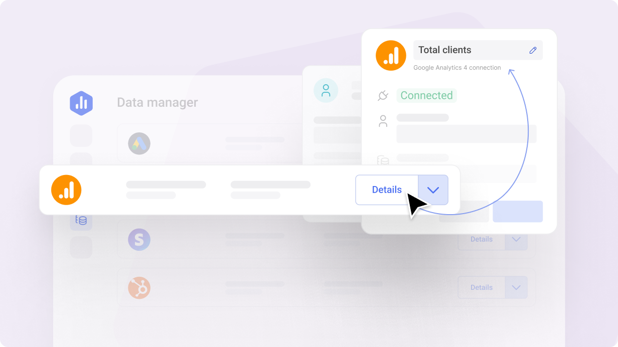
Instead of navigating to the Account Management Application, you can now edit data source and user details directly inside the Databox app.
Click "Details" on a data source or "Edit user" on a teammate to open a pop-up and make your changes, so you get admin work done faster.
Close The Gap In Your Reporting Stack With Custom Integrations
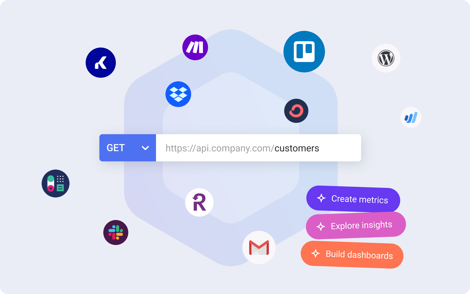
Connect almost any API to Databox and turn the response into a structured dataset, no code required.
- Get the complete picture: Bring in data from internal systems, niche platforms, and custom-built tools so your reports reflect everything your team relies on.
- Replace the workarounds you've been maintaining: Swap manual exports, one-off scripts, and fragile automations for a connection that syncs on its own.
- Make custom data accessible to the whole team: Anyone on your team can ask questions about the data through Genie or in your favorite AI tools.
Configure Your Charts To Match The Metric
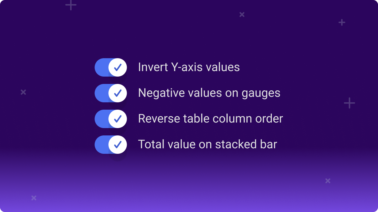
We've added four new chart settings to give you more control over how your data is presented, so every chart on your Databoard communicates insights clearly.
- Show the best result at the top of your chart: Invert the Y-axis on line and bar charts so metrics like search rankings read the way your team expects.
- Track scores that span negative ranges: Set negative starting values on gauges to visualize metrics like Customer Satisfaction Score across the full -100 to +100.
- Put the most recent period first: Reverse the column order on tables with column granularity, so your team sees what's current without scrolling.
- Show the per-period total at a glance: Display total values on top of stacked bar charts, so the combined value of all dimensions reads without anyone doing the math.
Meet Genie, your AI Analyst
Ask questions about performance in plain language and get clear, contextual answers in seconds
- Get answers from your data, instantly: Ask any question and get answers with charts and context pulled from your actual metrics.
- Build metrics and Databoards by describing what you want: Tell Genie what you want to track or visualize, and it builds it.
- Share insights with anyone: Send a link to any Genie conversation with teammates or external stakeholders
- And more!
Connect Databox to Your AI Tools
Connect Databox to tools like Claude, ChatGPT, n8n, and more, so you can answer questions faster, and act on them immediately.
- Ask questions and get reliable answers instantly, grounded in the metrics, definitions, and historical context your team already trusts
- Combine Databox data with information from other tools in the same conversation to understand what’s driving performance, without exporting or reworking data
- Move from insight to action faster by triggering workflows, alerts, and summaries automatically when performance changes
- Meet your team where they already work, so insights show up inside the AI tools and workflows they use every day
350+ New Integrations Unlocked with Dataddo
Now, you can connect Dataddo, a no-code data integration platform, directly to Databox to sync and prepare data from 350+ tools for analysis.
With Dataddo and Databox, you can:
- Bring in data from anywhere: Connect 350+ additional tools, like Amazon Advertising, Monday.com, Adroll, Asana, and many more!
- Make more of your data analysis-ready: All Dataddo-synced sources are dataset-compatible, so you can clean, merge, and format data before it powers your reports and custom metrics.
- Build custom metrics that reflect your business: Merge datasets and calculate columns to create metrics aligned with your team’s goals, processes, and definitions of success.
- Give every stakeholder the full picture: Whether you’re blending data across departments or sharing reports with execs, your dashboards and reports will include everything that matters.
Bring Internal Data Into Dashboards Your Team Actually Uses
Now, you can connect popular cloud databases and warehouses, like Amazon RDS, Aurora, Oracle, and MariaDB, directly to Databox, making your backend data accessible to the teams who need it most.
- Make key data accessible: Bring internal system data into Databox, prepare it for analysis, and add it to dashboards your team can actually use.
- Monitor metrics in real-time: Track product, finance, or operational performance as it happens.
- Unify reporting across systems: Combine backend data with CRM, marketing, and support metrics to get a more complete picture of performance.
Bring In Any Data From Any Source, With The New API
With Databox’s new API, you can now send structured, raw data from any source directly into Databox, so you can centralize more of your business data and help your team make faster, more informed decisions.
- Centralize all your key data: Send raw, row-level data from any internal system and use datasets to prepare it for analysis.
- Create custom metrics that track what matters: Slice, filter, and format your data to report on your most important metrics.
- Analyze and act faster: Filter dashboards by dimensions, drill into row-level details, and monitor goals in real time. Combine your custom data with metrics from other tools to uncover insights across teams and systems.
Plan More Confidently for the Future
Now, when building your forecasts, you can factor in the metrics that influence your main KPI, so you can identify what’s driving results and plan with more confidence.
- Understand what drives performance: Add the metrics that impact your main KPI to uncover which factors have the greatest influence on your results.
- Validate your assumptions before committing: Model increases or decreases in key metrics to see how different plans could play out and choose the most realistic path forward.
- Choose the right method for your data: From trend-based to regression or smoothing models, select the forecasting approach that best fits your business.
For example, if your team is forecasting Monthly Recurring Revenue (MRR), you can add metrics like New MRR, Churn Rate, and Expansion MRR to see how each one affects your forecast. Then, model a 2% drop in churn to understand how that change could impact MRR and set targets your team can confidently deliver on.
Turn Your Strategy Into Measurable Results With OKRs
Now, you can build and track OKRs in Databox to keep every team aligned, accountable, and focused on the work that drives results.
- Clarify your strategy: Capture your company’s mission, vision, and long-term ambitions to guide what matters most.
- Align every team: Define high-level objectives, then break them down into measurable goals and sub-goals with clear ownership.
- Measure progress automatically: Link goals to the metrics you already track in Databox to keep performance visible and up to date.
- Add context to updates: Include notes and status updates to explain results, celebrate wins, and highlight what needs attention.
Want to learn more about OKRs and how to use them in Databox? Read the blog.
Apply Multiple Filters to Your Databoards and Uncover Insights Faster
Now, when visualizing metrics created from a dataset, you can apply multiple filter conditions to your Databoards to quickly explore performance across different views.
- Focus in on the right view: Add multiple filters to individual Datablocks or entire Databoards to focus on what matters.
- Refine your analysis: Use operators like Is, Is Not, Contains, and more to filter your data exactly how you need.
- Get answers quickly: Once you’ve applied your filters, click into the metric to see the raw, row-level data behind it – already filtered based on your selection.
- Work faster, without extra setup: Apply or adjust filters on the fly without creating new metrics, new Databoards, or changing your original configuration.
Get More Context Automatically in Your AI Performance Summaries
Performance Summaries will now automatically include additional data points like goals, forecasts, benchmarks, average values, and more, to give you richer context and more relevant recommendations.
For example, you’ll get a clear, written explanation of your progress toward goals, along with insights into key trends and changes, making it easier for stakeholders to understand your results.
New Dataset Integration: Zendesk
Bring your Zendesk data into Databox, build the exact metrics your support team needs, and do deeper analysis.
- Build datasets: Select the specific object, like tickets, users, or posts, you want to analyze. Prepare the data for more reliable reporting.
- Merge datasets: Combine Zendesk data with data from other tools to analyze performance in context.
- Create custom metrics: Apply dimensions and filters to save the exact version of the metric you need.
- Visualize and analyze performance: Create Databoards that combine Zendesk data with metrics from other tools. Then, break down and filter by dimensions, compare trends over time, and drill into the row-level details.
- Set and track goals: Choose the metrics you want to improve, like faster replies or fewer tickets, and track your progress in real-time.
New Dataset Integrations: Google Sheets and Excel
Now, you can use Google Sheets and Excel with datasets, giving you the ability to prepare your spreadsheet data for deeper analysis.
- Build a dataset directly from your Sheet or Excel file
- Prepare and standardize your data by applying filters, changing data types, hiding, reordering, or renaming columns
- Merge datasets to analyze row-level data across multiple sources
- Calculate new columns to reflect your custom business logic
- Click on metrics created from your datasets to view the row-level data behind them
New Dataset Integrations: Intercom and Snowflake
Now, you can use Intercom and Snowflake with datasets, giving you access to more properties and segments, and the ability to do deeper analysis.
With these dataset-supported integrations, you can:
- Create custom tables of raw data from Intercom or your Snowflake database
- Prepare your data by applying filters and customizing columns (change data types, hide, reorder, or rename them)
- Merge datasets to analyze the same row-level data across multiple sources
- Calculate new columns to create derived metrics that reflect your business logic
- Export your data to CSV to keep a historical record or continue your analysis elsewhere
- Click on the metrics created from your datasets to view the row-level data behind them
New: MongoDB Integration
Connect MongoDB to Databox to make your backend data more accessible and actionable for your team.
- Build datasets: Select the specific collections you want to analyze, then clean and standardize your data for reporting.
- Create custom metrics: Apply dimensions and filters to save the exact version of the metric you need.
- Visualize and analyze performance: Use a variety of chart types to explore your data, break it down by dimension, compare performance across time periods, and drill down into the row-level details.
- Empower your team: Make your database data more accessible and actionable for your team.
Edit Performance Summaries to Include Insights That Numbers Alone Can’t Explain
Now, you can edit the text of AI-generated Performance Summaries on your Databoards and Reports.
Use the AI-generated summary as a starting point, then edit the text to add the context only you can provide, like what actions were taken, what you’ve been testing, or any open questions you’re still exploring.
Then, format the summary to make key points stand out. Use bold, italics, or highlights to emphasize important takeaways or add emojis to make your text more engaging and easier to scan.
Watch a quick tutorial to learn about this new improvement.
Manage Data Sources and User Permissions Across All Accounts – from One View
Now, you can view and manage all data sources and users across your agency and every client account—from one place. This makes it easier to save time and stay organized as your agency grows.
In the Account Management Application (AMA), head to the User Permissions or Data Manager pages to:
- See everything in one view – all users and data sources across every account
- Filter your view – by client account, connection status, role, and more
- Quickly take action – troubleshoot connection issues or review user access without switching accounts
Make Sure Your Databoards and Reports Are Always On-Brand
Now, you can save your visual settings as the default for new Databoards and Reports.
This means that every Databoard or Report you create will automatically use your preferred colors and logo, so everything stays consistent and polished, right from the start.
- Create a consistent visual style across all your Databoards and Reports
- Save time by overriding existing Databoard and account templates across your account and client accounts
- Quickly apply your default settings to all client Databoards and Reports to match your brand– or theirs!
Dive Deeper Into Metrics Right from Your Databoards
Now, when previewing your Databoards, you can click on a Datablock to expand the metric and explore it in more detail.
For example, if your sales drop week-over-week, you can expand the metric to compare trends, filter by rep or region, and switch visualizations to spot what’s driving the change. Then, save your changes to update the Datablock with your preferred view, making it easier to communicate insights with the rest of your team.
Quickly See The Status Of Each Goal With Color-Coded Charts
You can now enable color-coded indicators on your gauge and progress bars to quickly see if you’re on track, at risk, or falling behind on your goals.
For example, if you’re displaying your Databoards on an office TV, your charts will automatically turn green, amber, or red based on performance, making it easy for everyone to understand progress and stay aligned.
Track Any Target with Manual Goals
Now, you can create manual goals to track success on projects, campaigns, or internal initiatives that aren’t tied to a specific metric. Just enter your targets manually—using numbers, percentages, or currency—and update progress over time.
- Add notes to give more context when updating progress
- Get automatic reminders to update your goal progress
- Share updates with key stakeholders, even if they don’t have a Databox account
- Monitor goal progress alongside notes and status updates on the Goal Insights page
Set Clearer Goals That Keep Everyone on Track
It’s now easier than ever to set goals, track progress, and give your team the visibility they need to stay aligned and hit their targets.
With the latest improvements to automatic goals, you can:
- Set multiple goals per metric, like realistic and stretch goals
- Add end dates and receive automatic status updates
- Get goal recommendations based on benchmarks, forecasts, and historical data
- Control who can view and follow each goal’s progress
- See how you’re pacing toward your goal and get additional context on the Goal Insights page.
Learn more about what’s new in Goals here.
Update The Date Range Of Your Report With One Click
Now, you can use the master date range picker to update the date range of all metrics and Databoards in your Reports, without editing each block individually.
Preparing for a quarterly meeting? Just select “Last Quarter” as your reporting period, and your entire Report will instantly update to reflect that timeframe.
Build Custom Metrics from SQL Without Writing a Single Query
Now, you can create custom metrics from your SQL databases without needing to know or write SQL queries.
Simply select the dataset data you need (like metric value, date, and dimensions) from a dropdown menu. This makes it easier for all team members, regardless of their skill level, to build metrics from your SQL databases!
The no-code SQL metric builder is available only for SQL databases that are supported by Datasets Integrations.
Merge Data From 2+ Sources
Now, you can merge multiple datasets together using a common identifier like email, user ID, or lifecycle stage to analyze performance across multiple sources. Then:
- Filter your columns by specific conditions like values, dimensions, percentages, and more.
- Use formulas to create new calculated columns of data.
- Customize your dataset by renaming columns or changing data types.
- Build custom metrics from your dataset and easily track performance on Databoards or include them in your reports.
- Export your dataset to CSV to keep a historical record or continue your analysis in Google Sheets or Excel.
Build Custom Metrics With Multiple Dimensions
Now, you can select and save multiple dimensions in a single custom metric.
Instead of creating separate metrics like Sessions by Country, Sessions by Device Category, and Sessions by Landing Page to analyze different segments, you can now save all three dimensions in a single metric.
This means fewer metrics to manage and more flexibility when breaking down or filtering your data on Databoards.
Available for select integrations, with more coming soon.
Segment and Filter Databoards in 1-Click
Now you can quickly apply a dimension or filter to your entire Databoard, making it easier to analyze performance across different segments.
For example, break down a marketing Databoard by Country to see how different regions are performing. Then apply a filter to only view data from the United States.
See the Details Behind Your Metrics With 1-Click
Notice a sudden spike in Signups? Or a delay in Closed-Won Deals? Click a metric on your Databoard to see the row-level data behind it.
You’ll see the exact rows and columns from your dataset—like email address, deal stage, or transaction amount—so you can quickly spot what’s driving the change and act fast.
This feature is only available for metrics built from datasets.
Prepare Data for Better Analysis Later
Create a custom table of raw data, so your team can analyze with more depth, confidence, and clarity later. Connect data from a dataset-powered integration (HubSpot, Stripe, SQL databases, etc), create a dataset from it, then:
- Filter your columns by specific conditions like values, dimensions, percentages, and more.
- Use formulas to create new calculated columns of data.
- Customize your dataset by renaming columns or changing data types.
- Build custom metrics from your dataset and easily track performance on Databoards or include them in your reports.
- Export your dataset to CSV to keep a historical record or continue your analysis in Google Sheets or Excel.
Structure and Style Reports the Way You Want
We've added new layout and content options to Reports, making it easier to present data and communicate insights more clearly.
- Choose a cover photo from a built-in image gallery to give your reports a polished, professional introduction.
- Add page dividers to break up content, create sections, and guide your audience through the story.
- Insert editable tables anywhere to add commentary, highlight supporting data, or outline next steps.
- Style your tables with custom borders, background colors, and more—so everything looks exactly the way you want.
Get Alerted When Important Numbers Spike or Dip
Now, you can enable Smart alerts for any metric to get notified when unusual patterns (like unexpected spikes or dips) are detected in your data.
For example, get alerted when your website traffic suddenly drops, ad spend spikes unexpectedly, or revenue takes an unusual dip—so you can address these issues before they become bigger problems.
Learn more about Smart alerts here.
Create a Comprehensive Written Report with the New Page Format
Now you can format your reports into beautiful long-form writeups, to give stakeholders all the information they need to understand how you’re performing. Add metrics, Databoards, images, and commentary in a seamless layout to give more context to your data. Then, customize it with a cover photo and emojis to match your brand.
Need a slide presentation instead? Switch between Pageless and Slides formats with just 1-click.
New: Reddit Ads Integration
Now, you can track and analyze your Reddit Ads performance in Databox.
- Track 126 pre-built metrics: Easily visualize metrics like Impressions, Spend, CPV, Engagement Clicks, and more to monitor campaign performance.
- Create custom metrics: Use the Metric Builder to break down key metrics by Campaign, Ad Group, Ad, Community, or Keywords, and apply filters to focus on the most relevant insights.
- Compare and visualize Reddit Ads performance alongside other paid channels: Create reports that combine data from platforms like Facebook Ads, Google Ads, LinkedIn Ads, and more, so you can easily see how your campaigns are performing across multiple channels.
- Optimize campaigns: Set up alerts, spot trends, and adjust your budgets to improve results faster.
Give Each Team Their Own Space
Create Teams to give them a space where they can add the Databoards, goals, reports, and key metrics they need to track. Assign users to each team, and add sections to organize your team by department or focus area.
For example, create a Marketing Team with sections for paid ads, content marketing, and SEO, each focused on their key metrics and goals. Or set up a Sales Team with sections like pipeline performance and revenue targets to keep everyone aligned.
Use it to:
- Give each team their own “home base” to track the Databoards, metrics, goals, and reports that are important to them.
- Improve your team’s speed-to-insights, by making it easy for leaders to find the metrics they need in seconds.
- Make it easy for your teams to view other team’s data without the friction of learning new tools.
Customize Your Report Layout with Rows and Columns
Now, you can easily add rows and columns to format your report exactly how you want.
Want to place a metric side by side with text? Create multiple columns and resize them to balance text and visuals. Need to add more context to your report? Add extra rows to include images, metrics, Databoards, or additional text.
Easily Recover Deleted Databoards and Loops
You can now recover deleted Databoards or Databoard Loops within 30 days. Simply filter your Databoards or Loops by Recently Deleted to find your deleted items, then click Recover to add them back to your workflow.
Harvest: Create Custom Metrics with the Metric Builder
We’ve released a Metric Builder for Harvest. You can now create custom metrics to help you better understand your team’s productivity, project progress, and financial performance.
- 5 report types: Choose from reports like Time Entries, Invoices, Estimates, Expenses, and Project Budget.
- 23 metrics: Track a wider range of metrics, such as estimated tax, total cost, invoice amount, and more!
- 24 dimensions: Group your data by Client, Project, or Team Member, or use report-specific dimensions to analyze your data from different angles.
- Filters: Filter your results by Client, Role, Project, and more, to focus on the data that’s most important to your business.
Apply a Comparison Period for All Metrics on Your Databoards
Now you can quickly update the comparison period for all Datablocks on your Databoard. Simply click the Master Date Range icon, select a Compare With period, and apply it to all Datablocks at once.
For example, update your Sales Performance Databoard to compare Last Month with the same period 1 year ago, so you can easily see how sales trends have changed without having to update each Datablock manually.
Build Databoards in Seconds with AI
Now, you can create beautiful Databoards with AI. Simply select a category like social media, sales performance, or support activities, and let AI automatically generate a Databoard using metrics from the top sources in that category. Then, customize it further to fit your needs by adding or removing metrics, updating background colors, adjusting the layout, and more.
Microsoft Ads: New Metrics, Dimensions, and Filtering Capabilities
We’ve added 5 new reports to the Microsoft Ads Metric Builder. Now, you can access even more metrics, dimensions, and filtering to help you better understand your ad performance and optimize your campaigns.
- 5 new report types: Choose from reports like User Location Report, Professional Demographics Audience Report, Keyword Report, Geographic Report, and Conversion Report.
- New metrics: Track metrics like Return on Ad Spend (ROAS) Average CPM, Top Impression Rate, and more to better understand the effectiveness of your campaigns.
- New dimensions: Group your data by keyword, country, city, or goal to analyze performance from different angles.
- More filtering options: Apply expanded filters that mirror the capabilities of the Microsoft Ads native UI, so you can focus on the data that matters most to your business.
Report Performance During Live Meetings with Presentation Mode
We’ve added new functionality to make presenting performance from Databox even easier.
Now, you can present your slides in full-screen mode and easily switch between them using your keyboard. Need talking points? Open notes to see them alongside your slides during your presentation, keeping you focused and on track.
Plus, enjoy new customization options, including a variety of font types, more flexible visualizations, and the ability to add branded backgrounds when exporting your presentations to PDF.
Track New Metrics for LinkedIn and Instagram
We’ve added new metrics to help you track your social media performance.
- 38 new LinkedIn metrics: Easily monitor engagement, reactions, and page views with metrics like engagement rate, career page views, total reactions, and more. View the full list of LinkedIn metrics here.
- 22 new Instagram metrics: Report on the performance of your Reels and Stories with metrics like Total Story Reach by Story, Total Reel Replays Count by Reel, Total Reel Saves by Reel, and more. View the full list of Instagram metrics here.
See if Recipients Are Reading Your Reports
Track the status of all email notifications sent from your account. See who the email was sent to, who sent it, and whether the recipients opened and engaged with it.
For example, see if recipients viewed this month’s report so you can adjust your follow-up to address any gaps in their understanding. Or, find out which emails bounced or are still pending so you can make sure reports reach the intended recipients.
Help Stakeholders Make Sense of Your Databoards
Add AI-generated summaries to your Databoards to help stakeholders quickly understand what performance is. Summarize up to 10 key metrics at once, and choose how you want the summary displayed by selecting the language, narrative style, summary length, and more!
Use it to
- Reduce the time you spend analyzing & summarizing data
- Automatically highlight key metrics and trends
- Help stakeholders understand their data by providing them with a written summary
Quickly Find and Analyze Unusual Patterns in Your Data
View historical anomalies (unusual spikes or dips in performance) for your most important metrics and KPIs. Toggle Highlight Anomalies on the Metric Insights Screen to quickly spot spikes or dips that fall outside the expected range. Then, investigate these anomalies to understand what might have happened.
For example, if you notice a decrease in Sessions last month, you can quickly find the anomalies and dates where they happened. From there, analyze the underlying data in GA4 to determine what might have caused the drop.
Know Which Levers to Pull to Improve a Metric
Now, when analyzing a metric or KPI on the Metric Insights screen, you can view 3 related metrics alongside it. This way, you can see what other metrics you should focus on improving in order to move the needle on this one.
For example, if you want to improve Sessions, you’ll also be able to see related metrics like Bounce Rate or Ad Clicks. This way, you can see which levers you can pull to improve Sessions and understand how changes in these metrics affect the main one.
Display Your Ad Creatives in Databoards and Reports
You can now view your Facebook Ads, LinkedIn Ads, and Pinterest Ads creatives in your Databoards and Reports. View your creatives, alongside your copy and metrics, to better analyze your campaigns.
Use it to:
- See which ad creatives perform best by viewing metrics like impressions, clicks, and conversion rates side by side.
- Share visually engaging reports with your team or clients.
- Analyze how different visuals and copy combinations perform to improve your messaging and strategy.
More integrations will be supported soon.
Save Databoard Loops as a Template
Now, you can save a Databoard Loop as a template and reuse it across all client accounts. Simply select the Loop template you need and customize it to fit each client’s needs.
Use it to:
- Onboard new clients faster
- Make your reporting more consistent
- Reduce repetitive work and minimize mistakes
Customize Your Forecasts, Then Save Them to Track Them Over Time
You can now adjust your forecasts to account for real-world factors like holidays, seasonality, and even financial events. Each forecast now includes a confidence score, giving you a clear picture of how reliable your predictions are. And, once you’ve made these changes, you can now save your Forecasts to reference them later.
Use this to:
- Track how your business is actually performing against predicted performance.
- Create more accurate quarterly or annual plans, while taking best and worst-case scenarios into account.
- Evaluate the reliability of your Forecasts and make decisions with confidence.
New Date Range Setting: Fixed Start Date with Rolling End Date
We’ve added a new Date Range setting to help you track your campaigns more easily. Now, you can set a fixed start date, and the end date will update automatically.
For example, set the start date to when your marketing campaign began, and the end date will be updated daily to include today’s data. This way, your Databoard will always show you the entire duration of a campaign, from the start date to the most recent data.
New Integration: Ahrefs Enterprise
Connect Ahrefs Enterprise to Databox to craft better visualizations and more comprehensive SEO reports.
With our new integration, you’ll get access to over 70+ metrics to better understand your organic performance and fine-tune your SEO strategy, from Organic Keywords to Live Backlinks.
- Add 40+ new metrics to dashboards to track your SEO progress over time, or view Ahrefs Enterprise data alongside other data from sources like GA4 and Google Search Console.
- Create custom metrics like Top Pages By Country, Backlinks by Internal Pages, or Organic Keywords by Page, to analyze how your URLs, keywords, and pages are performing, and find opportunities to improve your rankings.
- Share automated performance updates via email or Slack to keep your team or clients informed.
Connect Now
⚠️ To connect Ahrefs Enterprise to Databox, you must be on an active Aherefs Enterprise subscription.
Need a hand? Explore our detailed guides:
New Integrations: Pinterest and Pinterest Ads
Now you have all the tools you need to effortlessly monitor your organic reach, track ad performance, optimize spending, and make more informed decisions about your Pinterest strategy.
- Build comprehensive dashboards to see all of your Pinterest and Pinterest Ads metrics in one place, or to view your Pinterest Ads performance alongside your other paid channels.
- Drill down into campaign, ad group, or ad performance, and easily filter results by specific keywords to gain valuable insights.
- Set and track goals for key metrics like ROAS, engagement, earned CTR, and more.
- Combine data from different marketing platforms to create a custom metric like Total Ad Spend or Total Impressions.
- Report campaign performance via Slack or email with Snapshots, Scorecards, Metric Digests, or Reports.
Apply a Date Range to an Entire Databoard Loop
Now, you can apply the same date range setting to all Databoards in a Loop. Simply select the Date Range you want to view and check "Apply to Whole Loop".
For example, update your Marketing Performance Overview Loop to review data from "Last Month" or "Last 45 Days" across every dashboard in that loop.
Improvements to the Way You Share and Present Reports
You can now embed your Reports into other platforms or share them using a live link. When you do, recipients can interact with the data by hovering over daily values, adjusting the date range on a report slide, viewing annotations, and more. You can also adjust individual slides to a full-screen view.
Use this update to:
- Share a live link to present reports to stakeholders on a call, focusing their attention on key slides by hiding the sidebar and notes view.
- Send the link to all attendees so they can further explore and interact with the data after the meeting.
- Embed reports directly into your client portals, CRM systems, project management platforms, and more!
See Your Most Recent Data by Manually Refreshing Your Databoards
Need to see your most recent, up-to-date performance on a Databoard? Now you can manually refresh your Databoards to ensure you’re looking at the latest possible data.
For example, refresh your Databoards before important meetings to present the most current information. Or, visualize the latest spreadsheet data by manually triggering a sync.
Manual refreshes are available up to 3 times a day. If you need more frequent syncs, you can purchase our 15-minute sync add-on.
Need a hand? Explore our detailed guide:
Enable or Disable Public Access for Individual Databoards or Databoard Loops
Users can now choose whether a Databoard or Databoard Loop is accessible through a public URL or an internal link.
- Simply enable public sharing to allow anyone with the link to view the dashboard, regardless of whether they are a user in your account.
- Or, disable the public URL and use the internal link to share your Databoards and Loops with specific users in your account.
All newly created Databoards and Loops will be private by default. Existing Databoards and Loops will remain publicly accessible, but you can switch them to private using the new Public URL toggle.
More Flexibility and Control Over Visualizations
With our latest improvements, users can now assign a color to each dimension on the chart, making it easier for viewers to understand and engage with the data.
For example, when analyzing a metric like Sessions by Country, you can choose a different color for each Country. Make Croatia green, the United States blue, Germany yellow, and more.
And now, you have even more options! You can pick from our preset colors or create your own metric and dimension colors by typing in a HEX code or using a color picker. This means you can match your charts to your brand’s colors or highlight important data with bright colors like red or green. Try it today and make your data look the way you want!
Add a Median Value to Charts and Tables
With our latest improvement, users can now add a median line to their bar and line charts or include the median value as an aggregation option in the table and pie visualizations.
For example, add the media line to more accurately see where the “middle point” of your data lies. And get a clearer indication of what’s typical in your dataset.
Work Faster, With Bulk Actions
Updating or editing your account just got faster and easier. With our latest improvement, you can now perform actions in your account in bulk:
- Add Metrics: Add important metrics to your dashboards and My Metrics screen all at once.
- Favorite items: Quickly mark metrics, dashboards, and goals as favorites or remove them in bulk
- Copy dashboards to client accounts: Select two or more dashboards and share them across multiple client accounts.
- Add dashboards to loop: Easily select all the dashboards you want to include in your loop. Then, choose to create a new loop or add them to an existing one.
- Hide dashboards on mobile devices: Select and hide multiple dashboards from the mobile app.
- Apply tags: Organize items in bulk by adding tags to your metrics, dashboards, reports, and goals.
- Delete items: Keep your workspace clean and organized by removing multiple dashboards, metrics, goals, notifications, and more, at once.
Klaviyo: New Metrics and Improved Filtering Capabilities
Gain more insights into your email marketing efforts with our latest Klaviyo improvements.
- 66 New Basic Metrics: Get a better understanding of your email performance by tracking metrics like Clicked Emails, Opened Emails, Marked Emails as Spam, and more. View the full list of Klaviyo metrics here.
- Group by Dimensions: Add dimensions to your data to create metrics like Opened Emails by Campaigns or Messages Sent by Message ID.
- Improved Filtering: Include filters to analyze the performance of Campaigns, Lists, Flow IDs, or Message IDs by keyword. For example, filter campaigns by the keyword “summer”.
- Guide: Using Klaviyo with Databox
- Overview: Metric Builder for Klaviyo
Need a hand? Explore our detailed guides:
New in Databox: Amplitude
Connect Amplitude to Databox and get valuable insights into your product and growth strategies. Understand user behavior, improve retention, and optimize engagement with your product.
- Build dashboards to see all of your product data in one place, or to view your product’s performance alongside other platforms like Stripe, Google Analytics, Salesforce, and more.
- Combine metrics from multiple platforms to create a custom metric like Lifetime Value (LTV) or Customer Acquisition Cost (CAC).
- Set and track goals to help increase Active Users or improve Average Sessions per User.
- Make more informed decisions about product development and user experience.
- And more!
- Guide: Using Amplitude with Databox
- Master Overview: Metric Builders for Amplitude
Or, explore our comprehensive list of Amplitude metrics here.
Need a hand? Explore our detailed guides:
New in Databox: Metric Insights
No matter your role, you’re probably keeping a close eye on a handful of metrics. While you can track them on dashboards or receive notifications about their performance, sometimes you need to take a closer look at a specific metric to help you improve it.
With the new Metric Insights screen, you can now access the information about a specific metric from one place:
- Visualization: View your metric’s performance over time and easily switch between different chart types.
- Goals: Track all goals associated with that metric and monitor your progress toward achieving them.
- Metric Comparison: Compare your metric’s current performance to a specific time in the past.
- Metric Description: View a brief description of your metric to help you better interpret your results.
- Performance Summaries: Read updates on your metric’s performance, so you always know how it’s performing.
- Benchmarks: Compare your metric’s performance against other companies, so you know if you’re ahead of the curve or have room to improve.
- Forecasts: See how that metric is likely to perform in the future so you can make more informed decisions and craft better plans.
The Metric Insights screen is available on all plans. However, features like Forecasts and Performance Summaries are exclusively available to users on Growth and Premium plans.
Want to learn more?
Check out our blog for all the details.
Compare Your Performance to Other Companies On Dashboards
Charts are great for visualizing trends and patterns, but without a reference point, it’s hard to know what “good” or “bad” performance looks like.
Now, users can add benchmark data directly onto their dashboard, to see how they’re performing compared to other companies. By including a benchmark line in a bar or line chart, users will be able to:
- Compare performance against standard benchmarks, custom cohorts, or similar businesses.
- Easily spot areas for improvement and make more informed decisions.
- Track goals alongside benchmark lines to see if your efforts are moving you in the right direction.
- Quickly see if you’re exceeding, meeting, or falling short of market tendencies.
Benchmarks are available on Growth and Premium plans. Starter and Professional plan users can request a trial by clicking:
Want to learn more?
Explore our detailed guide: How do I add Benchmarks to my Databoards.
New in Databox Analytics: Advanced Security
Growing teams need more robust security measures, and the new Advanced Security settings can do just that.
What’s included:
- Forced 2FA (two-factor authentication): Reduce the risk of unauthorized access by forcing all users to complete an additional verification step.
- Activity Log: Track all account activities, including adding/removing users, creating metrics, deleting dashboards, and more.
- Active User Session: Monitor who’s accessing your account and where they are doing it from.
- Login Records: Review successful and failed login attempts to detect unauthorized access.
- Forced SSO (Single Sign-On): Ensure a more secure login experience through mandatory SSO for authorized users.
Advanced Security settings is available for purchase as an add-on to Account Owners and Admins on Starter, Professional, and Growth plans. Users on Premium plans will have access to all settings as part of their plan.
Enable Advanced Security Settings
What to learn more?
Check out our blog for all the details.
New in Databox Analytics: Benchmarks
We added a new Benchmarks feature to the Databox Analytics app. With the Benchmarks feature, users can compare just about any metric in their account against competitors. And:
- Create cohorts by applying filters like industry, company type, company size, and annual revenue to browse benchmark data based on what matters most to them.
- Save their most important Benchmarks so they can see in which directions their metrics are moving.
- Compare Benchmarks to the previous period to track how their performance changes over time.
- Quickly see how they outrank competitors with color-coded charts – red when they're below the median, and green when they’re ahead.
Benchmarks are available on Growth and Premium plans
Want to learn more?
Check out our blog for all the details.
NEW visualization types and more powerful charts are here
We've added new visualization types and improved existing charts to give users the flexibility to explore the data however they want.
Now users can:
- Use advanced charts to make complex data easy to understand - Radial Progress, Spiderweb Diagrams, Bubble Charts, Data story, and more.
- Add multiple metrics to a single visualization to see how different metrics relate.
- Change the colors of individual Metrics to make it easier to identify growth opportunities.
- Quickly switch between different visualization types to find the best way to represent your data.
As part of this update, we've deprecated and transitioned some of the visualizations to the new visualization types.
Read more about it here.
Explore New Visualizations
Want to learn more?
Check out our blog for all the details.
Introducing Your New Admin Hub
Managing users, permission, and settings just got a whole lot easier!
With the new Account Management Application (AMA), we centralized all advanced settings in one place.
Administration of the account just got easier:
- Easily update account details, including the account owner and company information.
- Add, delete, and edit user permissions across all Databox products.
- Customize and brand your Databox account with white-labeling.
- Manage client accounts, including details like account manager, user permissions, client name, and more.
- Access advanced settings for your Data Source connections. Manage user permissions, metadata, timezone, and more.
- Enable single sign-on (SSO) to improve security measures.
For more details on how to use AMA, check out this help article.
New Metric Library is here
We have updated the Metric Library, making it a one-stop shop for learning about metrics and integrations directly within Databox app
Search the Metric Library to:
- Get a detailed description of your metrics and integrations, including troubleshooting guides to help master the use of any integration.
- Quickly access pre-built Dashboard templates to get ideas on what to track.
- Find answers to common questions with help articles.
Performance Screen now in mobile app
Access the Performance Screen on your phone with our latest Databox mobile app update.
With this latest addition, you can easily:
- Set up and monitor up to 10 metrics or goals.
- Receive a comprehensive Performance Summary filled with valuable data insights and growth recommendations.
- Keep an eye on your Top 5 trending up and Top 5 trending down metrics from your Metrics screen.
- Stay in the loop with Insights Activity, Data Insights, Account Activity, and Recommended Content.
Download or update your app today:
Introducing Dark Theme
Elevate your Databox experience with a sleek and stylish dark interface that reduces eye strain and makes late-night data deep dives a breeze.
Enabling Dark Theme is simple:
- Click on your user profile
- Toggle on "Dark Theme" to enable it in your account.
Introducing Performance Summaries
You don't have to be an 'expert' to get the insights you need from your data. Our brand-new AI-powered Performance Summary tool makes this easier than ever!
With the click of a button, you can:
- Use color-coded indicators to quickly assess the performance of your most important metrics, goals, and dashboards.
- Read a comprehensive summary of your performance to quickly understand where you're at.
- Get actionable recommendations and ideas on how to move the needle on your most important metrics.
- Use metric insights to stay on top of daily or weekly changes in your most important metrics and KPIs.
Available on both Growth and Premium plans. Read more about the capabilities of the Performance summaries here.
Try Performance Summaries now
or contact customer support for a trial.
NEW Metric Forecasts
KPI forecasting is important for any business. It can guide decision-making, improve strategic planning, and provide a competitive advantage. But, reliable forecasting can be a complex and costly process. That’s why we are bringing you powerful new feature - Metric Forecasts.
What can you expect?
1️. Adjustable Forecasting Period: With custom periods for previous data and forecasted data, you can select the period of forecasting that suits your unique business needs.
2️. Data Story: Uncover the context behind your existing data in a concise text format, facilitating effortless sharing with your team.
3️. Enhanced Forecast Chart: See a forecast, complete with a confidence interval, alongside your goal line, and effortlessly monitor your goals
Start making informed decisions based on data-driven predictions with Metric Forecasts.
Try Metric Forecasts now
or contact customer support for a trial.
New: Databox Performance Screen
Our new performance screen allows you to select and quickly access your most important Metrics and Dashboards and to get some additional customization options along the way.
Here are just some of the things you get -
- We have merged the Goals and Metrics section - you can now add up to 10 metrics and/or goals. This comes with the ability to rearrange metrics and goals to suit your preferences.
- There is a new Trending Metrics section, allowing you to easily identify 10 Metrics from My Metrics page with the largest up and down changing trend.
- All Metrics and Goals are clickable and lead to the Metric Detail page for quick access to additional data.
- We have also added a new Recently Viewed items section enabling faster access to recently viewed Databords, Databoards Loops, and Reports.
The best part is - we are still not done, we will continue to work and improve on your performance screen experience.
NEW: REST API and 30+ Custom API Integrations Available Now in Databox
Pull in data right from within our interface without a 3rd party service.
For starters, we are happy to introduce 30+ Custom API Integrations to help you pull data and create custom metrics on your own (or with the help of our experienced team).
Our custom API Integrations replaces the need for tools like Zapier or Integromat—this means you no longer have to maintain these tools (less logins to track) or pay for them.
Connecting a Custom API integration to Databox is relatively simple. Just log in to the tool from within our interface using OAuth, or by entering your API key from the tool.
Once you do that, you will see a new interface where you can pull data from the other tool’s API and then build custom metrics from the data.
New: Weekly Metric Performance Digest
You can now get a weekly digest of how your most relevant metric is trending, delivered directly into your inbox.
This is a great way for every individual team member to keep an eye on their critical KPIs. You can get the Weekly Metric Performance Digest email for your selected KPIs set up quickly today, and then check the Metric Detail Page for additional information if the numbers require it.
Depending on which data you want to see, you can set it up for last week and get an e-mail every Monday, or for current week and get it on Friday. There are also additional customization options.
The best part is that the email puts your data into context so that you can compare whether your KPIs are trending up or if further effort is needed to get them where they need to be.
Introducing Databox Metrics Details Page
Until now, a metric had to be added to a dashboard in order to view its data. This meant the occasional guess-and-check work to ensure you were choosing the right KPI to track.
Metric Details Page has changed that.
You can now see additional data for each metric by clicking on it. This helps you get insights into each metric you are currently tracking, without adding it to a Dashboard first.
In addition-
You can see an overview of the metric performance over pre-defined time periods-
- Previous month
- Week to Date
- Month to date
- Year to date
All you need to do is go to the Metrics page, hover over any metric, and click on the “View Details” button.
Read more about this update here.
Introducing Databox Reports
Here at Databox, we believe that data is about more than just numbers. We want to bring our users even more ways to share meaningful insights. Most of all, we want to help growing teams and agencies take reporting to a new level through the power of automation.
Say hello to Databox Reports.
This brand new feature allows teams and agencies alike to build and automate Reports right inside Databox. You can now—
- Build custom deck-like Reports within the app
- Pull dashboards you’ve already built directly into your Report
- Add context and build a story around that data for your team and clients
- Automate your entire process by scheduling recurring sends and reminders
- Email or export Reports as PDFs, making them easily shareable across devices
For those who want to take their Reports even further, the Performer plan includes more advanced features, like: the full suite of slide types (add images, drill down into a single metric, and provide context for stakeholders), plus our most unique capability to date…
… automate the content of your report with dynamic text—what we’re calling “Data Stories”.
Read more about the update here.
Do you have improvement ideas or feature requests? Curious about what’s coming in Databox? Check out our interactive product roadmap that allows you to request, upvote, and stay updated on product updates.
Check out the video to see how it works.
New in Databox: TikTok Ads integration
New in Databox: Google Sheets Wizard
New in Databox: Select a Date Range for Scheduled Snapshots.
Reporting on your data is usually the most challenging part of tracking your performance, especially if you have to create multiple reports for multiple people.
But, what if each of your report recipients want to see the data from different time periods without having to select the Date Ranges they want in each report?
Well, now you can choose which Date Ranges you’d like to display on your Databoard when you’re creating a Snapshot, allowing you to send out the same Databoard multiple times to different people while selecting a different Date Range for each Snapshot.
Check out the video to see how it works.
Or read more about it here.
New today: 6 (more) Improvements to Databox Charts are now Live🤩
Just a couple of weeks ago, we announced a bunch of customer-facing improvements to our visualization capabilities.
Today, we're excited to share a few more. Six, to be exact.
Among a few other things, these improvements give you more ways to compare your current performance to previous periods and let you change the order of your metrics in certain visualizations more easily.
Check out the video to see all of the updates.
For more on these improvements, read the full release here.
New: 11 Improvements to Databox Charts Are Now Live
Over the last year, we've been quietly working to add significantly more analytical horsepower to Databox.
Today, we're excited to announce the first batch of customer-facing improvements to our visualization capabilities as a result of this work.
Toggle stacked line and bar charts on and off, add total values to your line, bar, and pie graphs, display comparisons for multiple metrics/dimensions in one graph, and much more.
Here's an overview of all the changes:
For more on these improvements, read the full release here.
Clean-up your unused Custom & Calculated Metrics
New in Databox: Track and Compare LinkedIn Ad Performance by Campaign Groups
We’ve added new Campaign Group metrics for LinkedIn Ads in Databox, allowing you to get even more granular into the performance of your LinkedIn Ad campaigns.
Want to see how specific campaign groups performed according to certain demographics?
Now, you can, by tracking and visualizing 11 popular LinkedIn Ads metrics by campaign group in Databox.
Explore the new metrics that were added and how they can be applied here.
If you have any questions or need help getting set up, you can visit our Knowledge Base, reply to this message or send us a message at help@databox.com and let us know which metrics you're looking to track.
New in Databox: Build Custom Google Analytics Multi-Channel Funnel Metrics & Understand How Your Marketing Channels Contribute to Conversions & Sales
Is Paid Search an initiating or a closing channel?
How much time has passed since a user's first and final interaction?
How many, and which channels, did users engage in before purchase?
With 110 new Google Analytics multi-channel funnel metrics that are now available in Query Builder, you can dig deeper into the conversion path your prospects take before becoming eventual subscribers, leads, or customers.
Check out which metrics were added and read more about them here.
Do you have improvement ideas or feature requests? Curious about what’s coming in Databox? Check out our interactive product roadmap that allows you to request, upvote, and stay updated on product updates.
New: Two-factor authentication in Databox
Want an easy way to keep your performance data even more secure?
We recently added two-factor authentication to Databox, which adds an extra layer of security to protect your account and data.
Setting it up takes just a couple of minutes, and you only have to do it once.
Read more on how to set it up here.
Or watch this short video.👇
Do you have improvement ideas or feature requests? Curious about what’s coming in Databox? Check out our interactive product roadmap that allows you to request, upvote, and stay updated on product updates.
New: Use Annotations to Explain Why Things Are Happening Directly In Your Databoards 😎
Why is traffic down this week?
What was that random spike in new revenue last Tuesday?
Questions like these are likely commonplace at your company.
Unfortunately, the answers aren’t always obvious. People have to go looking for them.
Thanks to Annotations, now you can add performance insights directly to your Databoards.
While it’s always been easy to add an Annotation to the Databoard you’re currently viewing, now you can add Annotations to any other Databoard using a specific metric visualization with just one click.
Or, watch this short video 👇
Do you have improvement ideas or feature requests? Curious about what’s coming in Databox? Check out our interactive product roadmap that allows you to request, upvote, and stay updated on product updates.
New in Databox: Pull Deeper Insights from Your Facebook Ad Campaigns with 25+ New Metric Types
How many views did your video advertisement receive?
How many people added payment info after seeing your ad?
With the new Facebook Ads Action Type metrics that are now available in Databox’s Query Builder, you’ll have less questions and more answers.
'Actions' in Facebook Ads track every engagement your ad receives–every comment, like, video view, link clink, add to cart, and more.
Check out which metrics were added and read more about them here.
Do you have improvement ideas or feature requests? Curious about what’s coming in Databox? Check out our interactive product roadmap that allows you to request, upvote, and stay updated on product updates.
What Should Databox Build Next?
Help us prioritize what we build next by adding your ideas and voting for your favorites at our brand-new roadmap website.
At Databox, customer feedback has always impacted our product roadmap. For years, our support and product teams have worked closely together to meticulously track customer requests in our internal project management tool and prioritize the most highly requested features, integrations and metric additions.
With our new roadmap website, we’re taking the next step of being fully transparent about our plans and making it easier for more of our customers to more easily have their say about our priorities.
Based on previous feedback, it’s clear that our customers want to use Databox for analyzing performance at a more detailed level, not just for reporting and monitoring high-level performance.
Accordingly, these are our top priorities in the coming quarters:
1. Implementing Custom Date Ranges for all integrations. Vote here to tell us which ones to prioritize first.
2. Adding new visualization types and improving existing ones. Vote for your favorite improvements or add your own here.
3. Drill down by Dimensions on Databoards. Need to drill down by two or more dimensions to analyze performance deeper? Vote here for this feature.
4. Lastly, vote for new native integrations and metrics you’d like to see us build.
Have another idea? Submit it here.
Custom Date Ranges Now Available for Two Data Sources for All Plus and Business Customers
Introducing White Labeling: A Fully-Branded Reporting Experience for Your Team and Clients 🤩
Imagine sharing Databoards with your company’s branding included. Not only that, but imagine that the URL that your team, clients, partners, or other stakeholders use to view that Databoard was branded on your own custom domain.
Or, imagine automating performance Alerts and Scorecards (with your company’s branding) that come from your company’s email domain.
Now, with Databox’s new white-labeling add-on, your company can present its own fully-branded reporting tool. Create consistency, impress customers and stakeholders, and create differentiation for prospects and investors evaluating you against other companies.
Starting today, we’ve enabled new white-label options that are available as an add-on to any Databox paid plan.
For more on how it all works, we recorded this brief video. 👇
Building dashboards with Databox just got a whole lot quicker
Today, we’re excited to announce two major improvements that make it easier and quicker to build Databoards with multiple metrics and data sources.
Now, you can:
1. Add multiple metrics to your metrics screen or Databoard in one click
2. Build Databoards with metrics from multiple data sources in just a few clicks with the improved setup wizard
Here’s how it works
Previously, you needed to add metrics to your Metrics screen and dashboards one-by-one. Now, it functions more like a shopping cart where you can add multiple items to your "cart" before "checking out."
Automate Snapshots of your Databoards in Slack
How often does someone message you in Slack about a performance update for a specific campaign or project?
What if you could eliminate those types of messages altogether?
Now, in Databox, you can automate daily, weekly, monthly, or even quarterly Snapshots to any public Slack channel. This way, everyone on your team is aware of how the key metrics your business cares about are trending without having to dig around for them or distract other team members to find them.
New: Track Form Submissions in CallRail
Tracking the volume of form submissions helps to validate and attribute ROI to your marketing efforts.
Now, with Databox’s Query Builder for CallRail, you can track and visualize Form Submissions along with the call tracking metrics you’re used to.
Which sources are driving submissions? Which pages are generating the most submissions?
You can track all Form Submissions in different time periods, create Drilldown reports showing where the submissions originate from, or use Filters to better analyze data that meets certain parameters.
With Form Submissions added to our Query Builder, you get more flexibility to customize and extend the tracking of your CallRail data.
View all of the default metrics available with CallRail here.
Do you have any questions about getting set up or even general questions about tracking CallRail performance? Reach out via chat or send us a message at help@databox.com. We're happy to help.
Add View-Only Users to Your Account & Share The Data, Not Editing Access
While you may need people on your team to be able to access performance data, not everyone needs to actually build reports or edit existing ones.
When too many people are doing this it creates added noise in your account which makes it harder to know which reports and metrics matter most.
That's why we've added the ability for you to add "view-only" users to your Databox account. This allows you to share performance with everyone without having to worry about that additional noise.
By adding a view-only user, you can ensure anyone on your team has access to performance data without allowing them to actually make changes to the reports or anything else you have set up in your account. They can only access Databoards.
Here’s how it works
New: Create Reusable Templates in Databox & Save Hours on Client Reports
Imagine that you only had to create reports ONCE and could easily replicate them across as many client accounts as you need.
Now, you can design your own templates, complete with the data sources, metrics, and visualizations that you need, and save them to your account so that they can be used for any client in just one click.
If you’ve used client templates before, you might be wondering, “What’s new?” Now, you can access these templates from within any client account. As before, the selected metrics and visualizations will populate automatically once the necessary data sources are connected.
Creating Account Templates is similar to creating new Databoards.
Here's how it works:We’ve improved sharing + privacy options for your Databoards
Starting today, we’re giving you more control over who can view the Databoards you create.
Want to quickly share a Databoard without giving someone full access to your Databox account? Use shareable links to easily share any Databoard with external stakeholders, i.e. clients, contractors, advisors, etc.
You can do this in just a couple of clicks. (You can see how in the video below.)
You can also use shareable links to quickly share Databoards with anyone on your team, too.
Also, speaking of sharing data internally, we’ve also updated your privacy options so you have better control over who has access to the Databoards you create.
Now when creating new Databoards, you can update the privacy settings from being visible only to you, to select users in your account, or to all users in your account.
Here’s how it works
Small improvements for visualizing performance
We’re excited to share a few smaller improvements to the app that give you more flexibility over the way you can visualize your performance data in Databox.
Basically, these improvements allow you to pull more insights with less work.
Check out the video, where we're going to walk you through the following 4 improvements...
- Updates for how your data can be presented in pie charts
- Smart y-axis scaling for even more performance detail on all of your charts
- More flexibility in how your data is presented in Table visualizations, and...
- The ability to quickly change dimensions for certain metrics on your Home and Metrics screens
Get Performance Updates Delivered in Slack
While everyone else is digging around different tools or combing through slides and spreadsheets, your clients' performance updates can be sent right to them... ...in Slack.
Yup. We just improved our Slack integration, which now allows you to automate daily, weekly, or monthly Scorecards and performance Alerts to any public Slack channel you want.
Just choose the most important metrics for any client, pick the time you want the update to be sent, and choose the Slack channel they want it delivered to.
You can even set this up for your agency so everyone has the most important KPIs top of mind.
Here’s how it works
Add Clients Quickly And Without Inviting Them to Your Account
Ready to track client performance in Databox, but not necessarily ready to invite clients to your account?
We've received feedback from agency customers that simply want to get started in tracking client performance right away.
Now, you no longer need to enter a client name and email address in order to add client accounts in Databox.
Instead, you can add new clients in bulk by simply typing the name of the client account and assigning an Account manager from your team to each client account.
Here’s how you do it.
No Direct Access to a Data Source? No Problem!
The average company may track data from dozens of different tools. And when it comes to bringing all of that data into one place, you might not have access to all of the tools in order to do so.
Now, we’ve made it simple to get access to the tools you need in order to track performance.
You can request access to a certain Data Source directly from Databox.
This way, you avoid writing emails or Slack messages back and forth trying to get the admin permissions to a Data Source that you need to integrate within Databox to create your reports.
Here’s how you do it:
Filter Databoards by Creator & Find The Data You Need Quickly
Do you ever feel like you spend more time trying to find data than you do analyzing it?
When multiple people and teams are building Databoards in order to track the metrics that are most important to them, it can get a little noisy and harder to find the things you need. Now, you can filter Databoards in your account by the person who created it.
This way, you spend less time trying to track down data from specific teams or individuals, and more time actually analyzing it and determining next steps...
Here’s everything you need to know about all of our Databoard filtering options.
P.S. We’re available to help you get anything set up, just respond here and let us know what you’re looking to track.
Easily Request Access to Data Sources Inside Databox
A Quicker Way to Find Databoards
New: Monitor All of Your Important Business Metrics From One Screen
Once aligned around the right metrics, you can set goals, create alerts, build share-able dashboards, all directly from the Metrics screen in just a few clicks.
With the metrics Screen, your organization can eliminate the manual work of tracking performance and reporting and shift that time towards taking the actions that improve performance.
New: Add Multiple Scorecard Recipients
New: The Google Sheets Integration is Live!
Turn your Google Spreadsheets into interactive dashboards that are available on desktop, office TVs, and your mobile devices.
The Google Sheets integration is available with all plans that include our Query Builder functionality. If your plan has access to Query Builder, you can login and start using the Google Sheets integration, as of today.
New: Schedule Looped Databoards in PDF format
The new PDF option will combine all looped Databoards in a multi-page PDF that will be attached to the scheduled email.
Schedule now
Instantly Visualize 3,000+ Metrics from 65+ Data Sources
With Databox, we’ve pre-configured 3,000+ of the most common metrics from every integration we’ve built. Just connect any one of these 65 tools, then choose the metrics you want to instantly visualize. But, with these latest updates in Databox, we didn’t just add a significant number of new pre-built Datablocks for every one of our integrations. We also made improvements to help you quickly find and visualize the KPIs that are important to you.
Embed Databoards: Share Live and Interactive Dashboards on Any Web Page or Application
Now, with the Databoard Embed feature, you can share and publish live dashboards on any web page, blog post, wiki page, web application, or intranet portal.
The coolest part? Embedded Databoards are fully interactive and live, meaning they’ll update live, wherever they’re published, as the data changes.
Introducing Flexible Grids
The new Databox Designer eliminates both limitations – fewer clicks are needed to reorder blocks, resize blocks or add new blocks to an already full Databoard. We’ve re-developed much of the code behind the Designer too, so it’s also much faster now.
Combine Your Data with Data Calculations
New pre-defined Datablocks added for Intercom, Drift, Prosperworks, Google AdSense, and 6 others.
Part of our ongoing strategy is to add more predefined Datablocks to the Datablock Library, making it easier than ever for you to pull the right metrics and visualizations right into your dashboards, no code or design necessary. Data blocks are accessible on the left side panel of the Databox designer. Simply drag-and-drop the desired metrics into your dashboard and the data, and visualization, with populate automatically.
In this update, we have added new predefined Datablocks for Intercom, Drift, Mixpanel, Seventh Sense, ProsperWorks, Marketo, Google AdSense, Intrix CRM, BitBucket, and GitHub.
Any metrics you'd like to see in the Datablock Library? We'd love your feedback. Feel free to reach out via help@databox.com and request your metrics.
New metrics: Active Campaign, Stripe, Facebook and Pipedrive CRM
Our Active Campaign, Stripe, Facebook and Pipedrive CRM integrations were recently updated with new metrics. In total there are more than 30+ metrics available for you to build awesome data boards.
You have requested, we have added. 🎉
ActiveCampaign (4)- Automations
- Automations by Status
- Automations by Total Contacts Entered
- Automations by Total Completions
- Invoices sent
- Invoices paid
- Invoices open
- Invoices overdue
- Overall Page Rating
- Deals Started Amount by Deal Owner
- Deals Started Amount by Pipeline
- Deals Started Amount by Status
- Deals Started by Deal Owner
- Deals Started by Pipeline
- Deals Started by Status
- Deals Won Amount by Deal Owner
- Deals Won Amount by Deal Creator
- Deals Won Amount by Pipeline
- Deals Won by Pipeline
- Activities Added by Owner
- Activities Completed by Owner
- Calls Added by Owner
- Meetings Added by Owner
- Tasks Added by Owner
- Emails Added by Owner
- Lunches Added by Owner
- Deadlines Added by Owner
List of metrics which we have renamed in order to be more self-explanatory:
- Deals Started Amount (prior New Deals $)
- Deals Started (prior New Deals)
- Deals Won Amount (prior Deals won $)
- Emails Sent (prior Emails)
- Emails Received
- Calls Added (prior Calls)
- Meetings Added (prior Meetings)
- Tasks Added (prior Tasks)
We love your feedback. Feel free to reach out via help@databox.com and request your metrics.
New predefined data blocks for MOZ, Xero, Active Campaign and others
Our continuous strategy is to add more and more predefined data blocks to our data block library. Predefined data blocks are accessible in the left side panel of the Databox designer and will help you to build even more powerful data boards for you or for your clients.
In this update, we have added new data blocks for HelpScout, Adobe Analytics, Active Campaign, Vimeo, Localytics, Xero and Moz.
Teamwork Projects Query Builder
With the Teamwork Query Builder you can now connect the entire Teamwork account rather than just connecting to a specific company. All companies and project can be filtered by dimensions available within the Teamwork account and make it possible to create reports across company/projects.
If you’re a Query Builder beginner, here is a help doc to guide you through the tool.
The Query Builder is available on our more advanced plans. If not available in your current plan, feel free to reach out to help@databox.com to enable the Query Builder for a test period.
Filter and segment your call performance metrics with the CallRail Query Builder
Our CallRail integration enables you to access 47 standard metrics and variety of date ranges.
To access even more metrics from CallRail we have built the CallRail Query Builder. The Query Builder allows you to access standard and custom metrics from your CallRail account, filter by specific parameters and choose from a variety of date ranges.
If you’re a Query Builder beginner, here is a help doc to guide you through the tool.
The Query Builder is available on our more advanced plans. If not available in your current plan, feel free to reach out to help@databox.com to enable the Query Builder for a test period.
New date ranges for Adobe Analytics, Youtube, Facebook Ads and more
Our continuous strategy is to update our existing Databox integrations to the Default list of date ranges. Default date ranges enable Databox users to dive into historical data and build more powerful data boards.
Default date ranges are already supported for the majority of our existing data sources, starting with HubSpot Marketing, Google AdWords, Facebook Ads and more.
In this set of improvement, we've added default date ranges to Adobe Analytics and Youtube integration metrics, for Facebook Ads and Salesforce we've updated the Query Builder date ranges. For the Salesforce Query Builder also All time date range is supported.
Default date ranges: Today, Yesterday, This week, This month, This quarter, This year, Week to date, Month to date, Quarter to date, Year to date, Last 7 days, Last 14 days, Last 28 days, Last 30 days, Last 12 months (Year), Last week, Last month, Last Quarter, Last Year.
New metrics: Shopify, HubSpot Marketing, Xero and more
In May we have added 20+ new metrics to our existing integrations, staring from Shopify, HubSpot Marketing to Youtube.
You have requested, we have added. 🎉
Shopify (9)- Gross Sales by Billing City
- Net sales by Billing City
- Total sales by Billing City
- Orders by Billing City
- Taxes by Billing City
- Shipping by Billing City
- Discounts by Billing City
- Returns by Billing City
- Quantity by Product Variant
- Plays by Video
- Actions
- Actions by Video
- Emails Sent by Email Title (by Created)
- Emails Delivered by Email Title (by Created)
- Emails Sent by Email Title (by Created)
- Emails Opens by Email Title (by Created)
- Emails Clicks by Email Title (by Created)
- Blog post views by blog
- Open Tasks by Owner
- Contacts by tag
- Income by Type
- Companies by Owner
- Open (unclosed) deals amount
- Videos by Watch Time
We love your feedback. Feel free to reach out via help@databox.com and request your metric.
New Integration: Track your top-ranking keywords with AccuRanker
With our new AccuRanker integration, you can analyze your tracked keyword performance and compare them against your competitor's domains added to your AccuRanker account.
Key metrics:
- Share of Voice
- Average Rank
- Keyword Ranking Distribution
- and +20 more
The easiest way to get started with analyzing your keyword performance is by using our free plug-and-play templates. We have prepared 3 templates just click on the images below to get started.
Template 1: Domain Overview

Template 2: Keyword Overview
Template 3: Competitors Overview
The All-New Scorecard
Scorecard sends you updates on your most important KPIs through email, mobile push notification, and/or Slack every day, week, or month.
We’ve made some pretty big updates that allow you and your team to take a more proactive approach to improving the business KPIs that matter most.
New Datablock "Advanced table"
Account progress & certification
Webapp improvements batch
- Carousel (loop) icon shown on looped Databoards and
- "Looped" Databoards filter added
- Empty Table datablock now 'dynamic' by default
- Databoard footer (sync information, master date range switcher) added to the preview popup
- Home Databoard options (on hover) rearranged
- Many 🐛 smashed